Creating scroll animations similar to Apple’s AirPods Pro page
Learn how to create the awesome scroll effects that Apple has on its website for some of its products

On a random Wednesday, I decided to check the cost of the AirPods Pro out of curiosity. But when I got to their website, I got curious about something completely unrelated. The amazing animation on scroll that showcases the AirPods made the experience of looking at the AirPods feel much more premium. So now I was really intrigued as to how Apple had done this animation and how some of the other websites like Sony and Samsung had pulled off similar pages.
I don’t think I ended up getting to know exactly what they used, but I stumbled across some very similar references and concepts that closely resemble the implementation. So without further ado, let’s get into it:
CSS position: sticky
My first idea was that they utilized position: sticky for styling the page since every image or frame sort of “sticks” to the area being displayed until a certain scroll position is achieved and is then replaced by a different frame.
The stick property as described in the MDN Web docs is:
Sticky positioning can be thought of as a hybrid of relative and fixed positioning. A stickily positioned element is treated as relatively positioned until it crosses a specified threshold, at which point it is treated as fixed until it reaches the boundary of its parent.
A quick example of position: sticky would be something as follows:

And on the face of it, it does seem like position:stickywould work for some basic animations, but when it comes to Apple’s page it seems like there would have to be too images to make this work but moreover sticky wouldn’t give an effect similar to what we needed here. Since sticky looks more like a replacement of the previous page rather than an animation of the existing image.
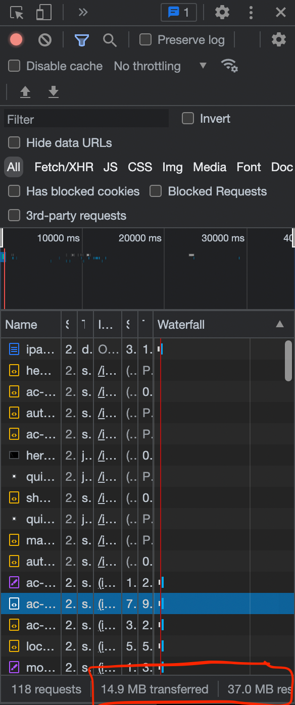
So what is happening here? One thing was clear that they weren’t using a video since the animation was dependent on scroll positions. So in other words every update to the frame would each need their own image update the current one already being seen and it wasn’t something sticky. It seemed probable that there was a bunch of images that are being loaded and every image just updates the frame to make it look seamless. Looking at the network calls, the above assumption proved to be right, there were a lot of images being used for it.

Canvas Element
After opening up my developer console, I realized that the website was using the <canvas> HTML element which made it clear that each image was being replaced by another based on the scroll position. But the copy on the page had some sticky elements to it primarily to make it be able to stick to the center and fade out after it was scrolled past (see below).

So how exactly should this <canvas> element be used to create what we want? The seamless animation that we have all been waiting for? I found some resources that helped do the exact thing with <canvas> (Ref).
But after confirming the elements being used in the implementation and researching, here is what I ended up building was something that looks like this:

Okay so how was this done exactly? Let’s start with a basic HTML file.
This is a very rudimentary HTML file essentially consisting of just one canvas tag and one p tag. There are also imports for js and css files which help create the animations.
Disclaimer: Keep the script import after the body tag here is because it needs the HTML elements to load before it executes and having it in the head tag would cause the file to stop working.
Then there was the css file where it would be some basic styling. First the html tag’s size is set to 100vh while the body tag which contains the scroll animation has a total size of 500vh . Then there is some basic styling for the copy, which has position sticky . Finally, the styling for canvas has a fixed positioning and is centered on the page.
Finally we get to the .js file where the actual magic happens for the animation.
Starting at the top, there are some calls to grab the canvas and the copy. The getContext() function returns a drawing context for the images that will be used in this tutorial.
Then there is a call to get each frame image with padStart to pad the start of each number with 0 to be 4 digits. Up next we define the source for the first frame by calling the first function, set our canvas height and width and use drawImage() on the context we created earlier to draw the image we got back from the call on the screen.
Finally, there is a scroll event listener added to help update the frames and the opacity of the sticky copy. scrollTop stores the users current position while scrolling whereas maxScrollTop stores the maximum that a user can scroll. Then based on how far the user is to the end, the opacity and frames are updated.
There is also a requestAnimationFrame() call which essentially updates our frame by repainting it. This is best described by MDN web docs:
The
window.requestAnimationFrame()method tells the browser that you wish to perform an animation and requests that the browser calls a specified function to update an animation before the next repaint.
And here we are, that is our animation similar to Apple’s AirPods pro page.
One final note here is that due to this loading a bunch of images there will be a need of a higher bandwidth for the page to operate smoothly.
To get around this Apple could use a lot of different techniques. But here we will just pre load our image.
References/Further Reading:
